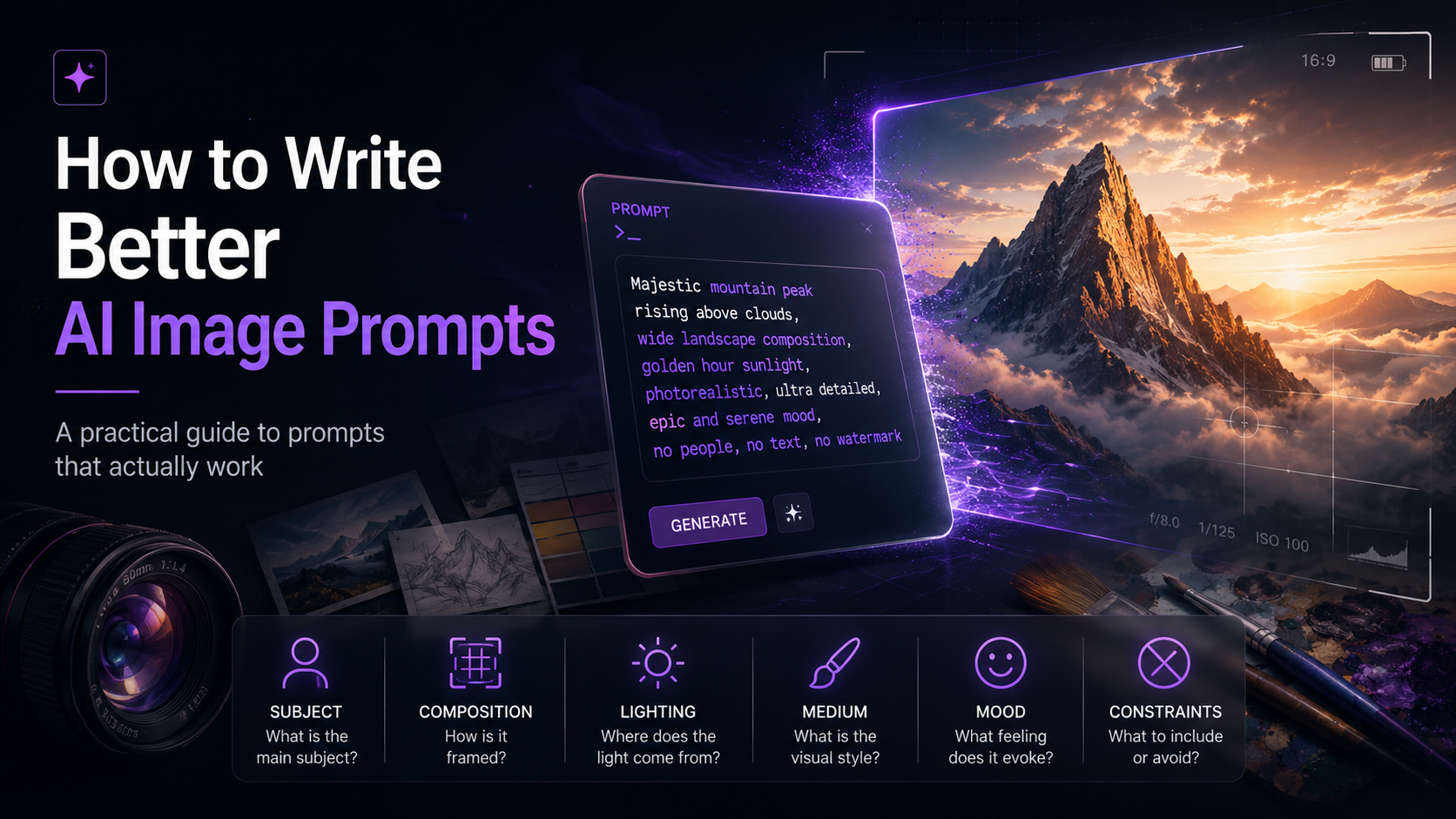
Write your prompt like a shot brief, not a wish. Use a fixed order: subject, composition, lighting, medium, mood, constraints. And use the words photographers and illustrators already use. "Golden hour" gets you further than "nice lighting" because the model has seen a million images captioned golden hour and exactly none captioned nice. Then change one thing at a time.
Most prompt advice is written to sell you an image generator. That's why it stops at "be specific," which is true and almost useless. When the picture on your screen doesn't match the one in your head, the problem is rarely that you gave too few details. It's that you gave the wrong ones, in the wrong words, in an order the model couldn't follow.
Here's the useful part. That vocabulary already exists, and you don't have to invent it. Photographers and painters spent the better part of two centuries building it, and every image model was trained on captions written in it. So you're not really learning a tool. You're learning the language the tool was taught in, which is exactly why this guide will still be worth something after the current batch of models gets retired.
The six-part formula
Write in the same order every time. Models don't require it. You do, because a consistent order makes your prompt debuggable: when something comes out wrong, you know which part to touch. Skip any part you don't care about. An empty slot just means the model picks for you, which is fine right up until it isn't.
Subject
One clear noun phrase. "A weathered fisherman mending a net," not "a beautiful scene of fishing life." Steer clear of abstract nouns as your subject. A model has no dependable picture of justice or freedom or nostalgia, so it'll reach for a stock-photo cliché instead.
Composition and camera
Where is the viewer standing? "Low angle, wide shot, subject off-centre left." Almost everyone skips this part, and it's the one that separates a picture that looks composed from one that looks generated. Framing is a decision. Don't make it and you'll get a centred mid-shot every time.
Lighting
Best value per word in the whole prompt. "Golden hour backlight, long shadows" will change an image more than three more adjectives about your subject ever could. Lighting handles mood, time of day and realism all at once.
Medium and style
Photograph? Oil painting? Isometric 3D render? Riso print? Name one, or the model falls back on whatever it saw most often for your subject, which is usually forgettable digital art. Naming the medium is how you take that decision back.
Colour and mood
"Muted earth palette, overcast, melancholy" gives you a completely different picture from "high-contrast neon, energetic," even with every other part identical. Both take four words. Fixing the colour afterwards takes considerably longer.
Constraints
Aspect ratio, text you need rendered, things to leave out, how reference images should behave. Put these last so they read as instructions rather than description. Negative prompts live here too, if your generator has them.
The formula, assembled
A fisherman mending a net.
A weathered fisherman mending a net, low angle, wide shot, subject off-centre left, harbour wall filling the background.
A weathered fisherman mending a net, low angle, wide shot, subject off-centre left, harbour wall filling the background, golden hour backlight, long shadows across wet stone.
A weathered fisherman mending a net, low angle, wide shot, subject off-centre left, harbour wall filling the background, golden hour backlight, long shadows across wet stone, 35mm documentary photograph, shallow depth of field, muted salt-bleached palette, quiet and unhurried, 3:2.
Every line takes one more decision back from the model. Notice the finished prompt runs about forty words. Dense, not long. Length isn't the point, and a tight thirty-word prompt will usually beat a rambling hundred-word one, because past a certain point the extra words just water down the signal.
The vocabulary that does the work
This is the part worth bookmarking. These terms pull more weight than their length suggests, because image captions in the training data use them constantly. They come from disciplines older than photography itself. That's the whole reason they'll outlast every model currently on the market.
Lighting
| Term | What it does | Reach for it when |
|---|---|---|
| Golden hour | Low, warm, directional sun just after sunrise or before sunset, with long shadows | You want warmth and instant photographic credibility |
| Blue hour | Cool ambient twilight, no direct sun | Cityscapes, melancholy, quiet |
| Rim lighting | A bright outline separating subject from background | Your subject keeps getting lost in a busy scene |
| Chiaroscuro | Extreme light-to-dark contrast, Renaissance style | Drama, portraits, painterly output |
| Rembrandt lighting | A small triangle of light on the shadowed cheek | Portraits that should look deliberately lit |
| Volumetric lighting | Visible shafts of light through dust, fog or leaves | Atmosphere, forests, interiors, god rays |
| Softbox, diffused | Even, wrapping light with soft shadow edges | Product shots and clean commercial looks |
| Overcast | Flat, shadowless, neutral | You want the subject read plainly, no theatre |
| Practical light | Light sources visible in frame: lamps, neon, candles, screens | Night interiors, noir, cosy scenes |
Camera and lens
| Term | What it does | Reach for it when |
|---|---|---|
| Shallow depth of field | Subject sharp, background dissolved | Portraits, products, isolating a subject |
| Bokeh | The character of out-of-focus highlights, those soft circles of light | Night scenes, fairy lights, romantic blur |
| Wide angle, 24mm | Expansive view, exaggerated depth, some edge distortion | Interiors, landscapes, a feeling of space |
| 35mm | Close to human vision. The documentary default | Reportage, street, unstaged realism |
| 85mm, telephoto | Compresses distance, flatters faces, brings the background closer | Portraits |
| Macro | Extreme close-up where texture takes over | Insects, food, materials, skin, fabric |
| Low angle | Camera below the subject, looking up. The subject reads as powerful | Heroism, architecture, monumentality |
| High angle | Camera above, looking down. The subject reads as small | Vulnerability, overview, scale |
| Dutch angle | Tilted horizon | Unease, tension, disorientation |
| Bird's eye, top-down | Directly overhead | Flat lays, maps, patterns, food |
Composition
| Term | What it does | Reach for it when |
|---|---|---|
| Rule of thirds | Subject placed off-centre on a third-line | Almost anything that looks too centred |
| Negative space | A large empty area around the subject | You need room for a headline. Also minimalism |
| Leading lines | Lines in the scene that pull the eye to the subject | Roads, corridors, architecture |
| Symmetry | Mirrored composition, centred subject | Formality, stillness, Wes Anderson energy |
| Framing | Foreground elements enclosing the subject, like doorways or branches | Depth and focus |
| Wide, medium, close-up | How much of the subject fills the frame | Always. It's the cheapest control you have |
Medium and style
| Term | What you get |
|---|---|
| Oil painting, visible brushstrokes, impasto | Thick, textured, physical paint with canvas grain |
| Watercolour, wet-on-wet, translucent washes | Bleeding edges, paper texture, light and airy |
| Gouache | Flat, matte, opaque colour. Mid-century illustration |
| Line art, ink drawing | Contour only, no fill, hatching for shadow |
| Isometric 3D | No perspective convergence. That game-map look |
| Cel-shaded | Hard-edged flat shadow bands. Anime and cartoon |
| Flat design | Solid shapes, no gradients, no depth cues |
| Pixel art | Visible pixel grid, limited palette |
| Risograph | Misregistered spot colours, grainy overprint |
| Claymation, stop-motion | Fingerprint texture and handmade imperfection |
| Art deco poster | Geometric, symmetrical, metallic accents. That 1920s travel-poster feel |
| Botanical plate | Fine-line scientific illustration on aged paper |
One warning about style. Naming a living artist is off-limits on several major platforms, and it's ethically contested pretty much everywhere else. Name the movement, the medium or the era instead: art deco travel poster, 1970s Kodachrome, Bauhaus geometry. You'll get a more controllable result anyway. A movement is a set of visual rules. An artist is a moving target.
Why the model ignores half your prompt
This is the most common complaint and the one nobody answers honestly, mostly because the honest answer is "the model has limits" and most guides are trying to sell you the model.
An image model doesn't read your prompt the way you wrote it. It turns your words into a mathematical representation, and that representation has a ceiling. Ask for twelve specific things and some get encoded strongly, some faintly, some not at all. Then the model produces the likeliest image consistent with whatever survived. It isn't ignoring you. It never got the instruction at full volume in the first place.
Three things follow from that:
- Front-load what matters. Earlier words tend to survive with more weight. If the red coat is non-negotiable, don't bury it behind four clauses about the weather.
- Counting is unreliable. "Exactly five birds" is a request the architecture is badly equipped to honour. Models keep getting better at it and it's still the single most common failure. If the number matters, generate and then edit. Don't prompt and pray.
- Negation is weak. This one's annoying. "No hat" often produces a hat, because the concept had to be encoded before it could be excluded. Describe the presence you want instead: "bare-headed, windswept hair." If your tool has a proper negative-prompt field, use that field rather than writing negation into the main prompt.
Models don't see letters as letters. They see text as a texture, a pattern that looks like writing, which is why AI images spent years producing very convincing gibberish on shopfronts and book spines. Newer models handle it far better, but the underlying mechanics still decide what works. Keep the text short, because a word or two survives where a sentence falls apart. Put the exact string in quotation marks so the model treats it literally. Describe the font style in general terms instead of naming a typeface. And if the lettering has to be exact, generate the image without text and set the type yourself.
Iterate like a scientist, not a gambler
When an image comes out nearly right, the instinct is to rewrite the whole prompt. Resist it. You'll throw away everything that was working and you won't know what you lost.
Change one variable. Regenerate. Compare. Lighting from golden hour to overcast. Lens from 35mm to 85mm. Medium from photograph to gouache. Two or three single-variable changes will get you closer than a full rewrite, and there's a longer-term payoff too: you actually learn what each term does in the model you're using. That knowledge stacks up. Prompt roulette gives you nothing to keep.
Two mechanics are worth understanding here, because between them they explain most of the "why is it different every time" confusion:
- Seeds. The same prompt gives you different images because generation starts from random noise. Fix the seed and the same prompt returns the same image, which is what makes single-variable testing possible at all. Vary the seed to explore, fix it to compare.
- Inpainting beats regenerating. If the composition is right and one element is wrong, mask that element and regenerate only it. Rerolling an entire image to fix a hand is how people lose an afternoon.
Keeping a character consistent
Text alone will not hold a face steady across images. It can't. You're describing one point in an enormous space and asking to land on it twice by coincidence. Every serious workflow solves this with images rather than words: a reference image, a character reference feature, or a small trained model of that face. If your tool offers a reference-image slot, that slot is doing work no adjective can do.
Text still helps in one way. Lock the invariant details into a block you paste every time, so same age, same build, same scar, same jacket, same hair, and change only the scene around it. It won't give you true consistency. It does narrow the drift.
The bottom line
Prompting isn't a trick, and there are no magic words, whatever an entire industry of prompt marketplaces would like you to believe. It's a shot brief written in the vocabulary of photography and illustration, in a fixed order, refined one variable at a time. The models will keep changing, and every one named in this article will eventually be retired. The word chiaroscuro has already outlived a few centuries of technology. It'll be fine.
Frequently asked questions
How long should an AI image prompt be?
Long enough to fill the parts you care about and no longer, so roughly 20 to 50 words for most work. Density matters more than length. A tight 30-word prompt where every word is doing a job will beat a 100-word one that repeats itself, because the extra words dilute the signal instead of adding to it.
Do negative prompts work?
They work in tools that give you a dedicated negative field, like Stable Diffusion and its descendants. Writing negation into the main prompt ("no hat") works poorly, because the model has to encode the concept before it can exclude it. Describing what you do want is almost always stronger than listing what you don't.
Why does the same prompt give me a different image every time?
Generation starts from random noise, and a seed decides what that starting noise is. Different seed, different image, even with an identical prompt. Fix the seed and you'll get the same image back, which is exactly what you want when you're testing one change at a time.
Why can't the model get the number of objects right?
Counting is a known weakness of the architecture. Precise quantities don't get encoded reliably. Models keep improving, but if an exact count matters, generate what you can and fix the rest by editing or inpainting rather than re-prompting.
How do I get readable text in an image?
Keep it very short, put the exact string in quotation marks, and describe the font style generally instead of naming a typeface. Models treat text as texture rather than characters, so short strings survive and sentences degrade. If the lettering has to be exact, like a logo or a headline, generate the image without text and typeset it yourself.
Can I prompt in the style of a specific artist?
Several major generators refuse living artists by name, and the practice is ethically contested regardless of what your tool allows. Name a movement, a medium or an era instead. You'll get more control that way, since a movement is a set of visual rules while an artist is a body of work that keeps changing.
Do I own the images I generate?
It depends entirely on the platform's terms and on your jurisdiction, and it changes. Some providers grant full commercial rights to outputs. Others restrict by plan or model tier. Copyright offices in several countries have also questioned whether purely AI-generated work can be protected at all. Read the terms for the specific plan you're on before you use anything commercially.
Find the right AI image tool for the job
The vocabulary in this guide works everywhere. The tool you use it in shouldn't be an accident. Browse curated, tested AI image generators on AISetApp and pick the one that fits how you actually work.
Browse AI image generators